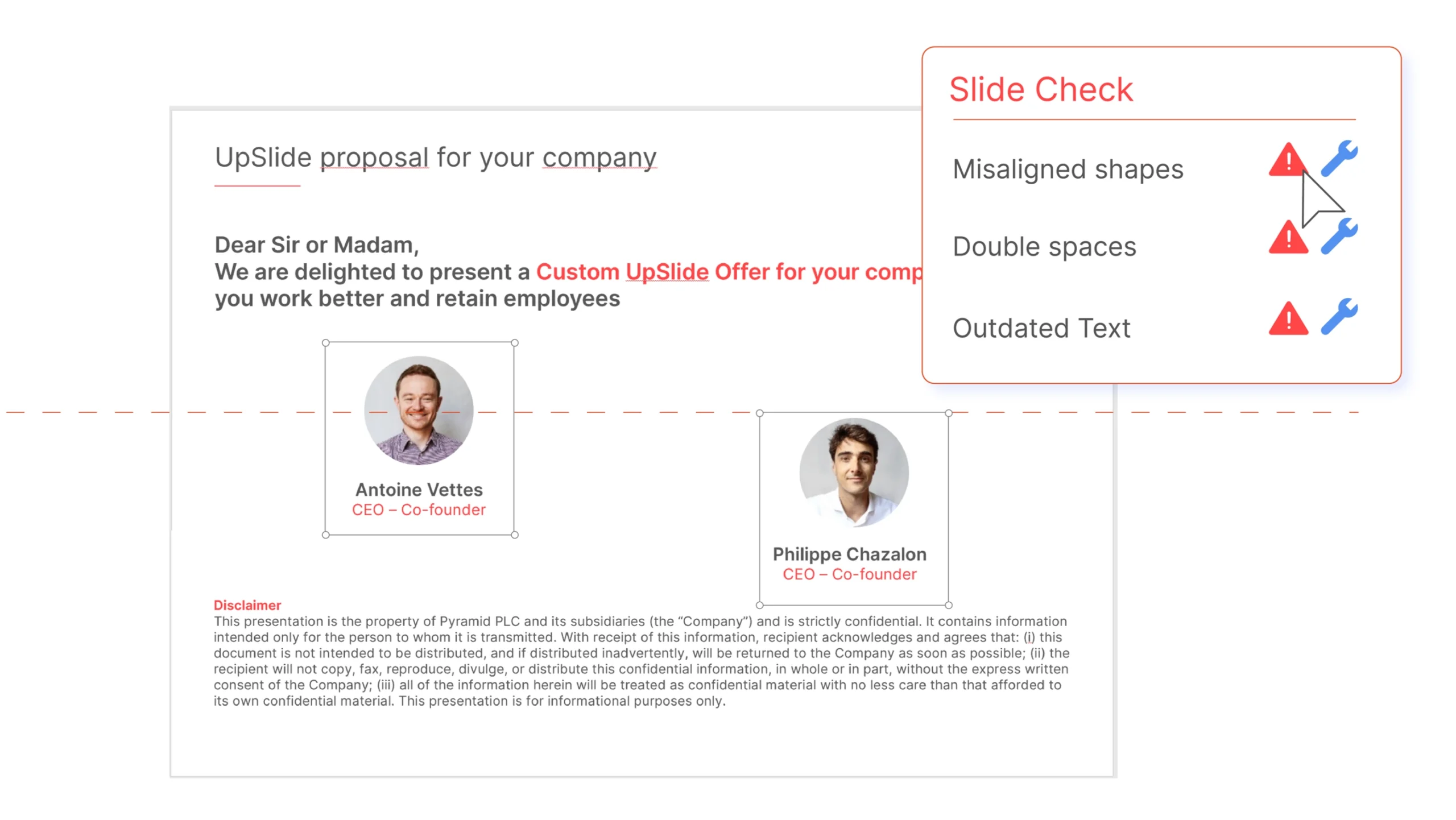
Microsoft PowerPoint was launched in 1990 and has since become the number-one presentation software, used by over 500 million people worldwide. On average, over 30 million presentations are created every day.
Despite this, even the most experienced PowerPoint users can still make mistakes. Misaligned elements, off-brand coloring and simple formatting errors can turn a great presentation into mediocre.
Here are eight of the most common problems, along with our best advice on how to avoid them:
TL;DR
Discover eight impactful PowerPoint tips from our Microsoft Office experts.
From using the native guidelines and templates, to ensuring you correctly align and distribute your slide elements – you’ll be creating perfect PowerPoints in no time.
Plus, learn how UpSlide’s Slide Check will help you review your presentation to ensure content is up-to-date and high standard.
Placing Content Outside the Guidelines
When creating content-heavy slides, many people make the mistake of using the full width of the slide to present their information. When it’s time to present, some of the information will be cut off the screen, and elements might not be printed off.
Solution: PowerPoint helps you with this by providing ready-made templates and guidelines to ensure that your content remains within the margins on every slide. This will prevent you from positioning any objects out of frame.
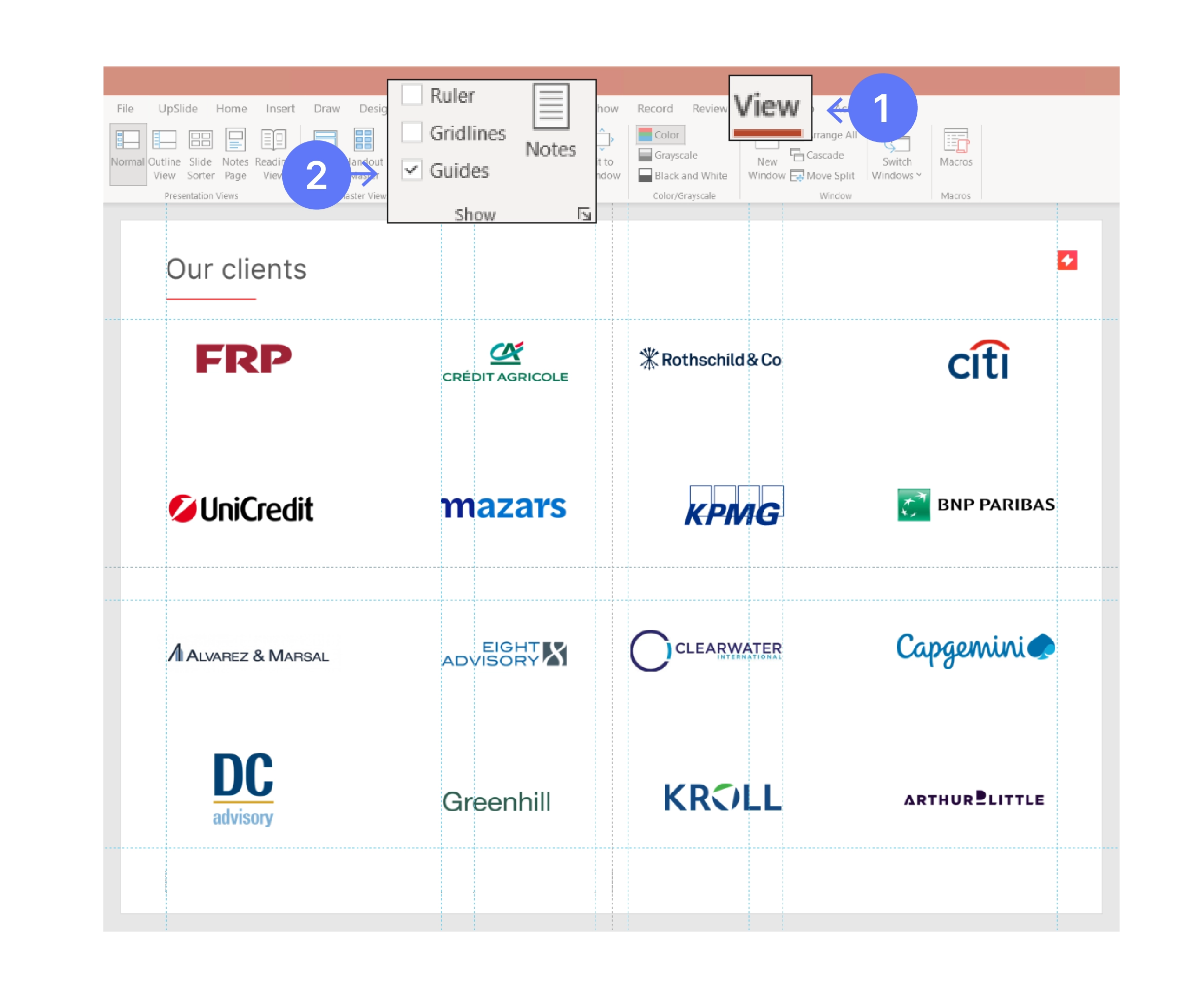
To use Guides:
- To show the Guides function in PowerPoint, click the View tab.
- Then check the Guides box. To hide the guides, uncheck the Guides box.
- After the guide appears, drag the element to the best position.
Keep all text, visuals and media within this frame to ensure your presentation is readable and impactful.
Misaligning Elements
When visuals, text or logos are misaligned in a PowerPoint slide it can be very disconcerting. Having elements aligned makes the slides look clean, concise and professional.
Solution: You can easily align objects in PowerPoint using Align and Distribute.
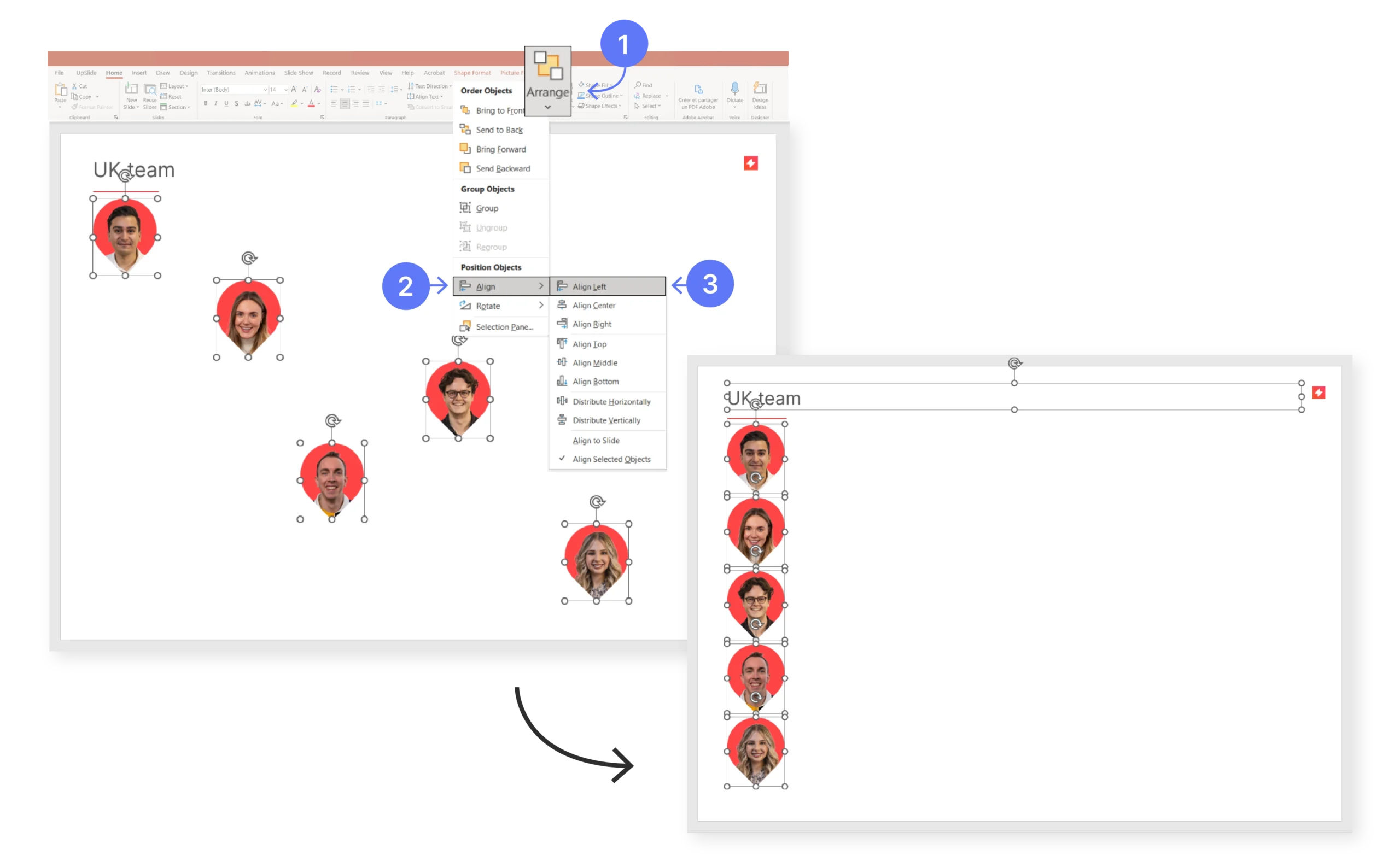
To use Align and Distribute:
- Select the elements in your slide you want to arrange.
- Click the Home tab to show the Arrange function in PowerPoint.
- Click on Arrange -> Position Objects -> Align. Then select your preferred option: Align Left, Right or Centre.
- Or, you can click on Arrange -> Position Objects -> Align -> Distribute
- Then select your preferred option: Distribute Horizontally or Vertically.
Discover how UpSlide automates routine arrange and align functions with one click.
Top tip
Ensure that each item is left-aligned and distributed vertically. This ensures that your slide is clean and easy to read, and your presentation is more impactful.
Using Non-Branded Colors
One common mistake in PowerPoint is using colors outside of your graphic charter. This harms the overall consistency and impact of your brand image.
Solution: We recommend using a color palette when building slides. Discover how to set one up below.
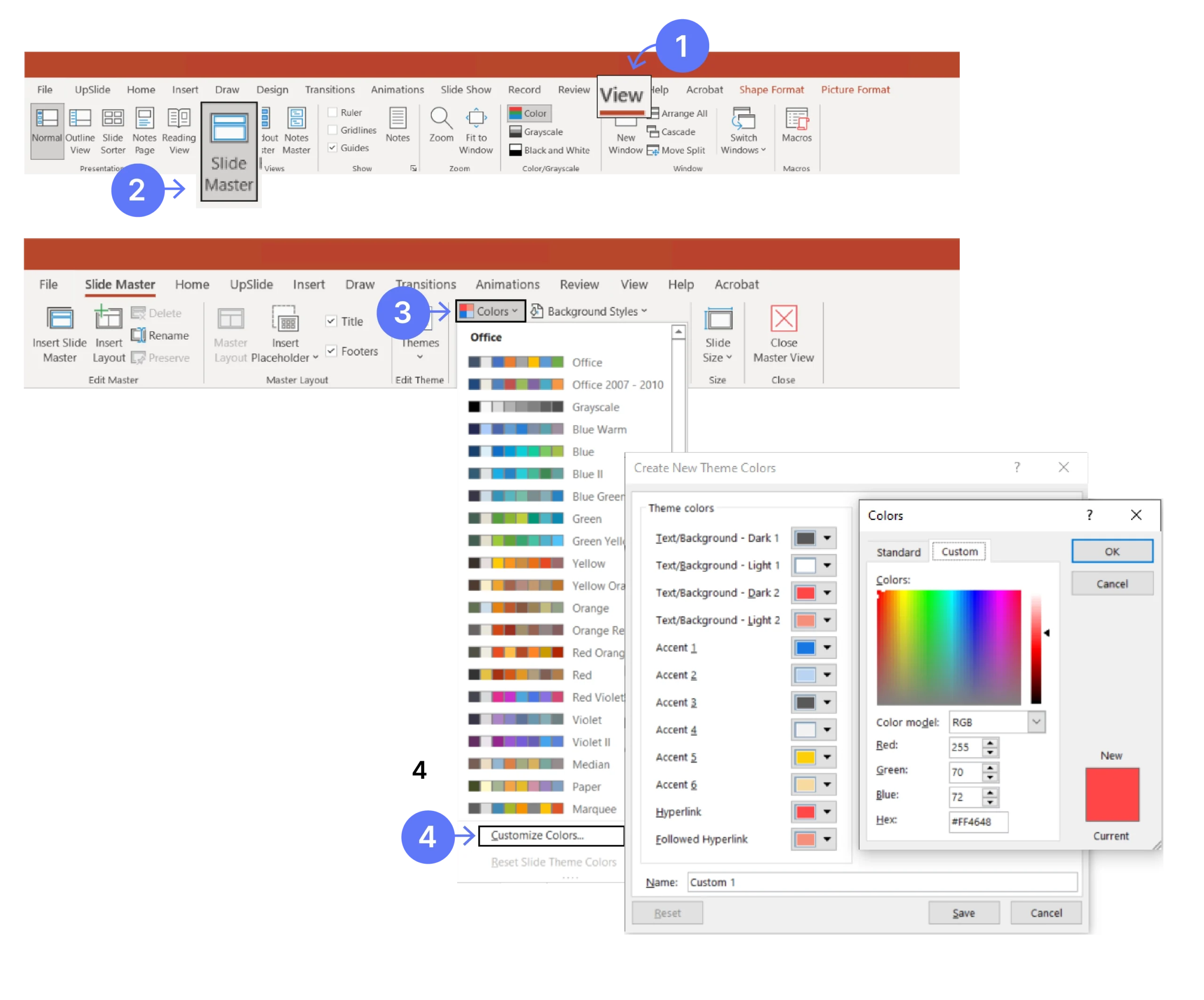
If you don’t have a color palette – then this is how you set it up:
- Click the View tab and open the Slide Master.
- Then click the Colors dropdown menu. At the end there is an option to Customize Colors.
- Select the dropdown menu on each color and add your brand colors using RGB #.
- Name it as your brand and save the new palette.
- Now you can reuse this palette every time you create a new PowerPoint presentation.
If you are designing a corporate PowerPoint presentation for a brand, following the visual identity guidelines is a must. Your brand colors encourage loyalty and easy recognition – make sure to use them!
Including Too Many Bullet Points
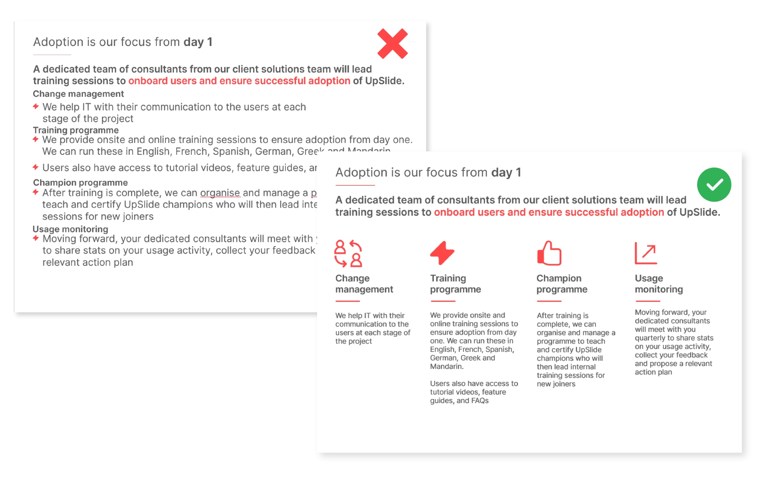
Over–using bullet points in PowerPoint makes information more difficult to read and less memorable – slides with visual aids are undeniably more effective than slides with only text.
Solution: Use different text levels to break up focus points. We suggest using icons for the most impactful effect.
These are sites where you can find icons to use in your PowerPoint presentations:
Adding Too Much Content to One Slide
Never put too many ideas on one slide. Filling a slide with text, images, and charts makes it easy for your audience to lose focus.
Solution: Designing a strong PowerPoint presentation by:
- Having no more than six lines of text per slide.
- Having short, clear headings separate from the rest of the text.
- Using words or short phrases rather than long sentences.
- Using a large font.
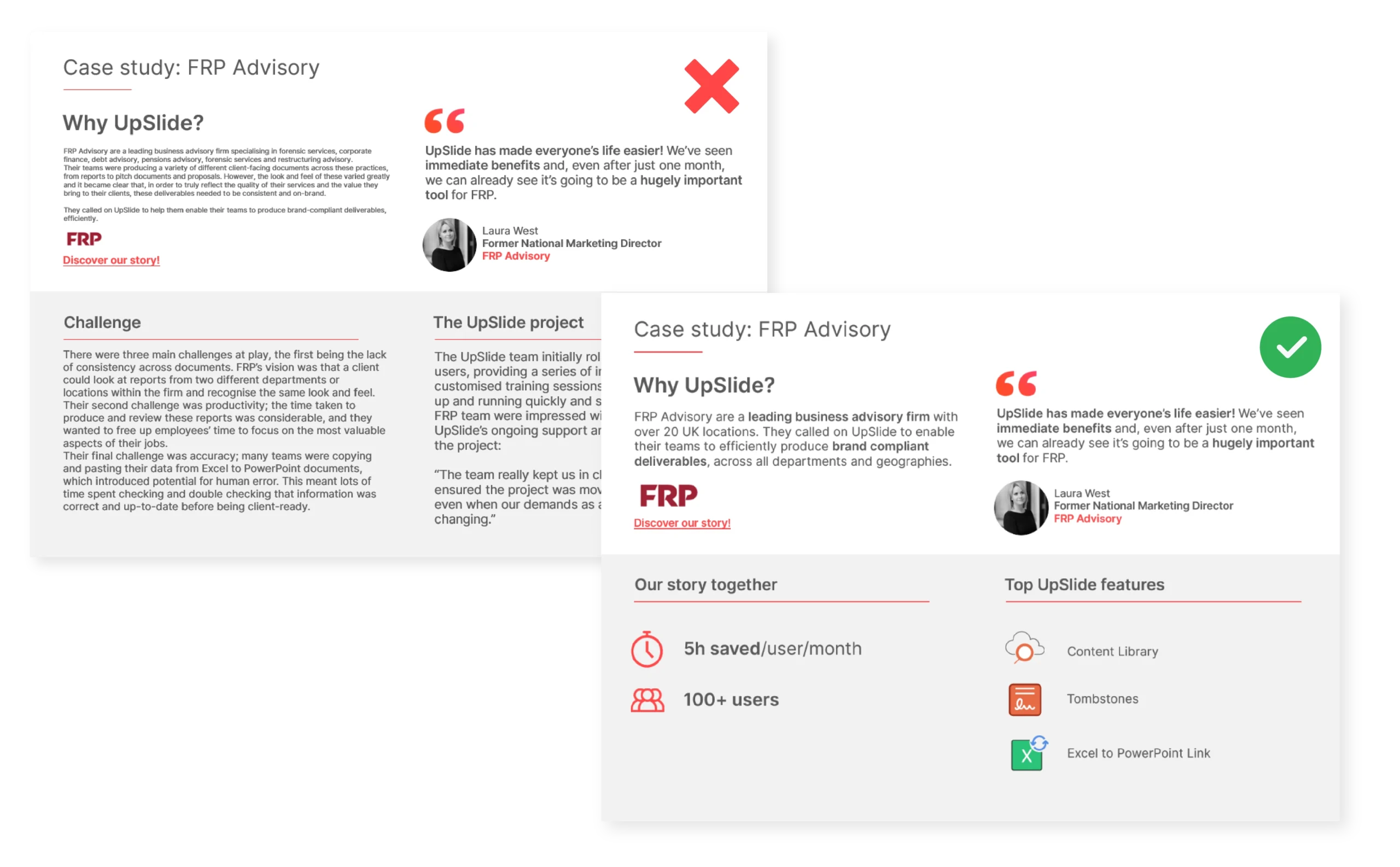
Follow these tips to ensure your whole company can produce impactful PowerPoint slides.
Overlooking Punctuation Errors
Placeholders like [XXX] can be a useful way of reminding you to add information, like contact details or addresses, down the line. However, when reviewing slides, unused placeholders and double spaces are often easy to miss.
Solution: Use PowerPoint’s Find & Replace function to help fix these errors.
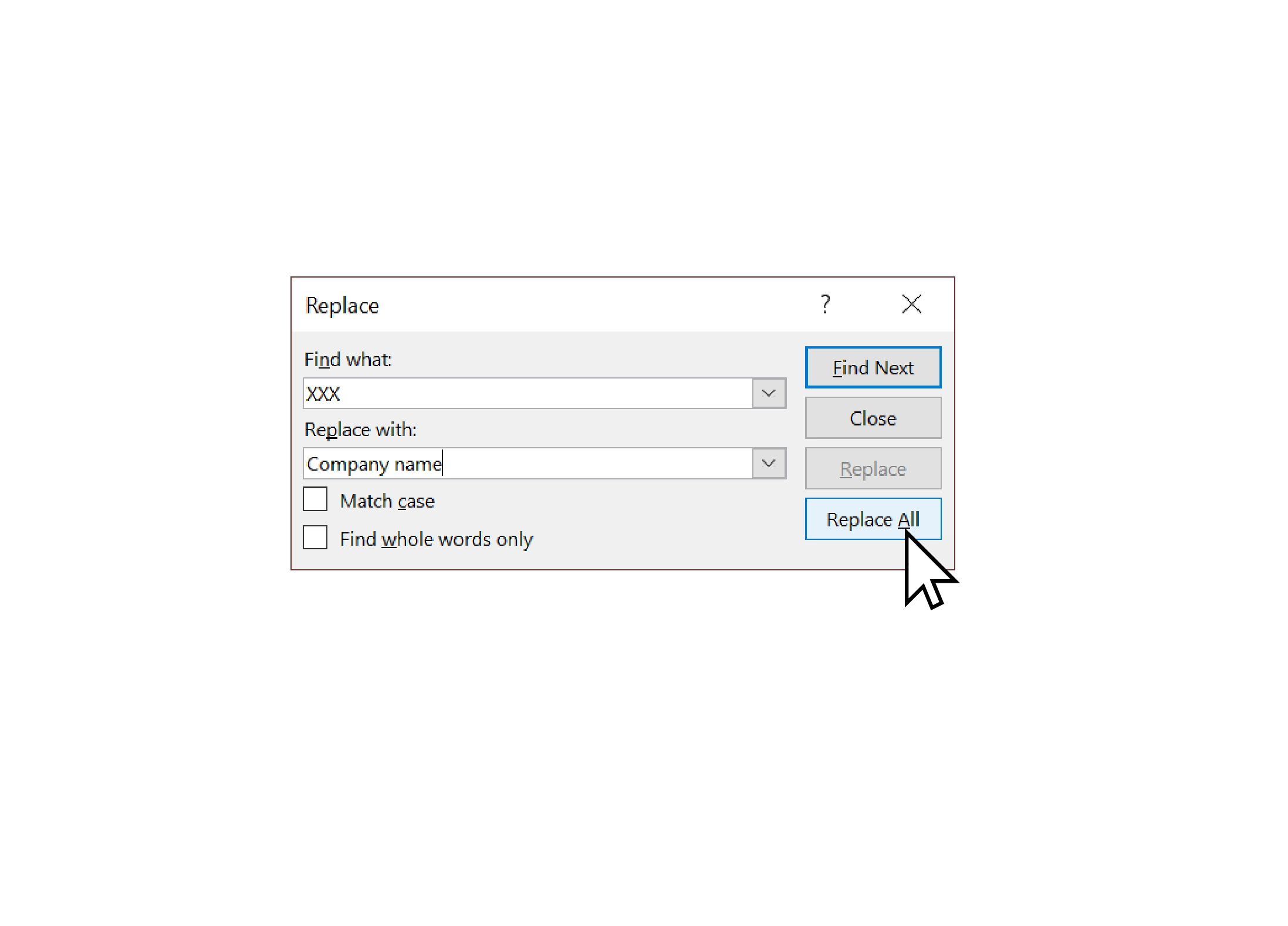
How to use Find & Replace to fix errors:
1. Launch the Replace function.
2. Select the Find what: field, then insert the suspected error.
3. Select the Replace with: field, then insert the correction.
4. Click Replace All.
Client-facing presentations should be error-free. Make sure to use this function to ensure quality and consistency throughout your PowerPoint slides.
Copying and Pasting Slides with Formatting
When you copy and paste slides between presentations, a lot of things can go wrong. In some cases, you might have to manually change the layouts of each slide, one-by-one, remove the master and layouts created by copy/pasting and much more. This can be time-consuming and painful!
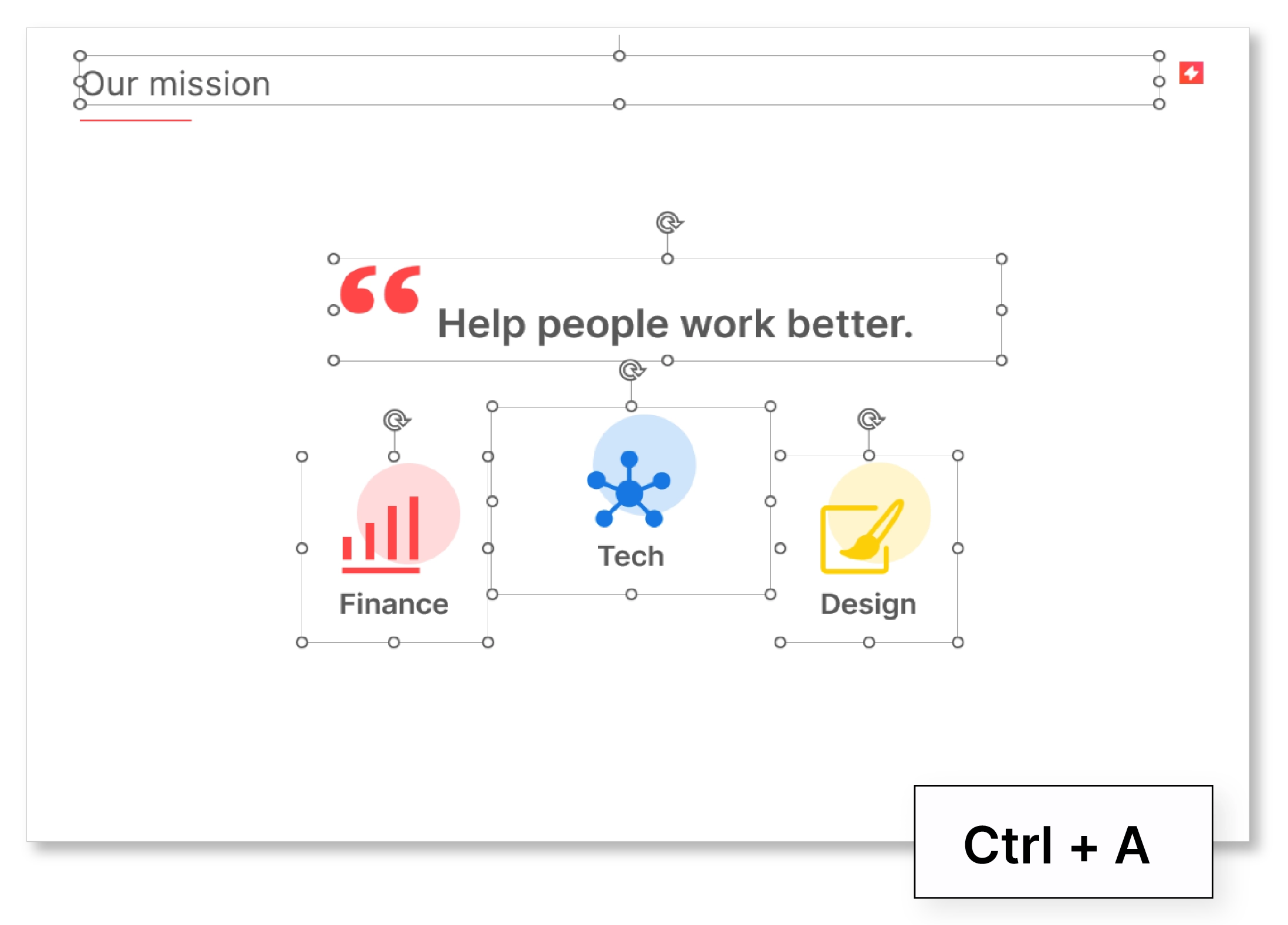
Solution: To copy slides and paste them into a presentation with a different style and format, hit CTRL + A and copy all the content, then paste it into the new slide. Do not copy the whole slide and then paste, as this is what causes the formatting errors.
UpSlide’s automated Slide Converter tool enables you to convert a set of slides from one presentation layout to another in just one click. This is a useful tool when going through a rebrand or brand refresh, and all assets have to be updated.
Including Inconsistent Formatting
If you use different bullet points, text formatting and text spacing in the same PowerPoint presentation, your slides could start to look confusing and unprofessional.
Solution: To boost the impact and credibility of your presentation, use the pre-set layouts available in PowerPoint to ensure your slide formatting is optimized.
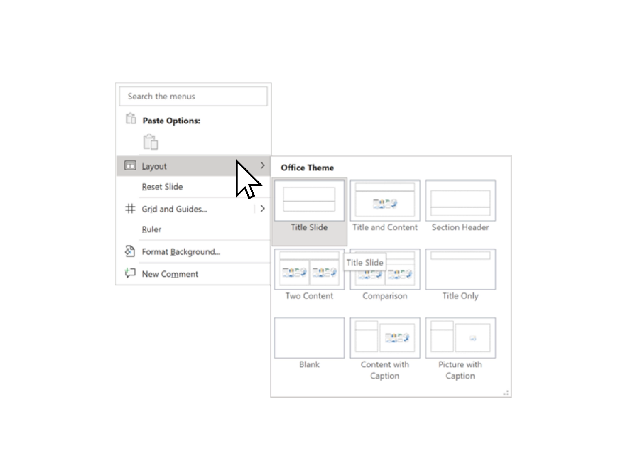
- Right-click on the slide.
- Select Layouts from the dropdown menu. This will display all the layouts available with different types of placeholders in their correct format.
- Choose the best layout to suit your content.
This helps you gain consistency throughout your slides and it saves you time constantly editing the different text levels.
BONUS: Proof for Errors with UpSlide’s Slide Check
UpSlide offers a feature which will check, review and resolve any of these mistakes in your PowerPoint presentation.
Slide Check reviews your presentation to ensure your content is up-to-date and meets your organization’s quality standards. Audit and correct your presentation with a single click. Identify errors such as:
- typos
- incorrect fonts
- outdated content
- misaligned shapes
- empty placeholders
and fix them with ease!
