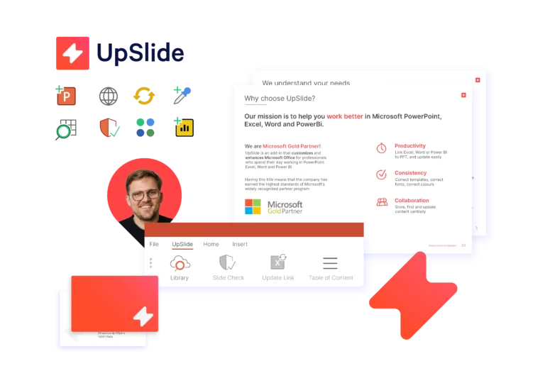
Discover our new visual identity – innovative, striking and more reflective of our values and expertise.
For 14+ years, UpSlide has been helping finance professionals work better on the Microsoft Office suite
165+
UpSliders contributing to our growth
+900
teams becoming more efficient every day
5
offices in three continents
This new graphic identity reflects our expertise in technology; having added Power BI to the Microsoft solutions we offer our clients, we are pioneers of the new interactive and digitalized financial report.
We also wish to further showcase our design expertise, to be an impressive and inspiring brand for our clients.
Finally, our new graphic identity codes reflect our unique philosophy and culture, in a time of dynamic international growth.
Antoine Vettesand Philippe Chazalon
Co-founders
Our new visual identity
UpSlide’s new colors are more contemporary and dynamic, reflecting our three pillars: Technology, Finance and Design, whilst working seamlessly with the Microsoft Office brand.
The Bolt represents the key principles of our values:
Productivity
Creativity
A reminder of UpSlide’s old triangles
It is the centerpiece of our new identity and will appear on UpSlide ribbons in PowerPoint, Excel, Word and Power BI.
Our new UpSlide colours
Carmine
Anthracite
Blue
#FF4648 – 255/70/72 – 0/82/58/0
For us, working better means working efficiently, obtaining exceptional results and enjoying the process. Carmine reflects the pleasure we want to bring back into our work.
#FF4648 – 255/70/72 – 0/82/58/0
For us, working better means working efficiently, obtaining exceptional results and enjoying the process. Carmine reflects the pleasure we want to bring back into our work.
#333333 – 51/51/51 – 70/60/56/68
Anthracite conveys our value of trust. As a software publisher, we want to provide our customers with reliability and stability.
Yellow
Gradient
#FDCF09 – 253/207/9 – 0/20/97/0
Yellow is used as a contrasting color. It is also the link between UpSlide and its sister company, F31, under the umbrella of the Pyramid Group.
From #FF4B2B to #FF416C
The gradient is used as the main brand color, both in the logo and on our materials, bringing the energy and creativity that makes UpSlide a unique company.
It was important for us to include our clients in this graphic redesign project.
As our best ambassadors, who better to make sure that the development is in line with their perception and their expectations of UpSlide?
They were present at every step of the project and contributed to its success!
My first impression on this new visual identity was very good! The logo is more playful, less rigid. I like a lot!