Icons are everywhere in our daily lives: applications, software, websites, etc. These pictograms or simple images allow us to easily navigate and interact with a graphic interface.
In 2019, Microsoft decided to rework its logos to enhance user experience on Office 365, which is intended to be simpler and more collaborative.
We decided to do the same by redesigning the UpSlide icons, with three objectives in mind:
- To take advantage of this development to enhance our visual identity
- To ensure our icons integrate into the Microsoft Office world
- To illustrate our values by combining efficiency and aesthetics
After a few months of work, our graphic designers and developers presented the new version of the UpSlide ribbon.
Would you like to do the same with your website or mobile application? Here is the method we used to redesign our graphic interface, in six steps.
TL;DR
This blog takes you through the six key steps to redefining your UI. From evaluating your graphic charter, to building the new components.
Hear top tips from our Microsoft experts on how to conduct an effective testing phase of your new interface.
Plus, see first-hand how the UpSlide brand has changed since 2011.
Graphic Discovery
Before we started, we began by defining a detailed set of criteria to effectively manage the project: a list of icons to be worked on, a strong graphic charter, the budget, time frame, delivery date, approval criteria and who would be involved in the project. This step allowed us to make sure that all stakeholders were on the same page.
Once you know which direction you want to head in and how you plan to get there, it’s time to explore and refine your graphic identity.
There are a variety of tools and methods to boost collective creativity, such as brainstorming, mood boards or the World Café method; choose the method that best suits your project and its objectives. In our case, we worked in “Crazy 8” style, which is our favorite brainstorming method because it is very simple to set up and incredibly effective. The goal is to generate 8 (or more) separate ideas per participant, in 8 minutes. It allows you to go beyond your first ideas – not always the most innovative ones – and to generate a wide variety of solutions. Arm yourself with pens, post-its and top of the range stopwatches!
For the UpSlide icons, we were looking to mirror Microsoft’s graphic codes. So, we worked on a graphic charter inspired by the Office Suite’s, colors and style.
Once the graphic guidelines were established, it was time to put them into practice!
Accelerated Creation
For maximum efficiency and agility, we chose to work in sprints: this is a method which uses iteration periods, mainly used in the IT and development field. The objective? To produce a first version in a few days, then test and analyze it before moving on to the next one, and so on. We talk about this more in our efficiency tips.
In our case, we did 5-day sprints, at the end proposing basic icons following the guidelines defined in the previous stage.
After completing a few sprints, we came up with three proposals that were neither too fancy nor too serious.
Interface and UX
After the design phase, it was time to bring together the selected graphic designs. The purpose of the merging phase is to review the proposals and reflect on their structure in order to guarantee future users a high-quality interface and experience.
It should be noted that whilst the User Interface (UI) and the User Experience (UX) complement each other, they are completely different: the first focuses on the “visual” aspect whilst the second looks at the “functionality” aspect.
This step is critical because your graphic interface will have a significant impact on the subsequent user experience.
For the new ribbon, we selected the type of icons that best met our specifications – in line with Microsoft Office’s style, but with a hint of UpSlide – and thought about how they would fit into PowerPoint, Excel and Word.
Microsoft already favours grouping by feature type, so we followed this structure to avoid disrupting Office user habits.
In order to make navigating easier for the user, we strengthened the layout of our ribbon by assigning a color to each group of features:
You may have noticed that some original Office features now appear in the “Blue Group” (Format and Shapes).
This is indeed the great new feature on the UX side: previously, the user would have had to alternate between the native tabs and the UpSlide ribbon to format his slides in PowerPoint. Now, some of the tools already present in Office can be accessed directly from the UpSlide tab, which will further boost the productivity and comfort of our users.
Production
Once the graphic design has been chosen and the interface structure decided, it’s time to build the components!
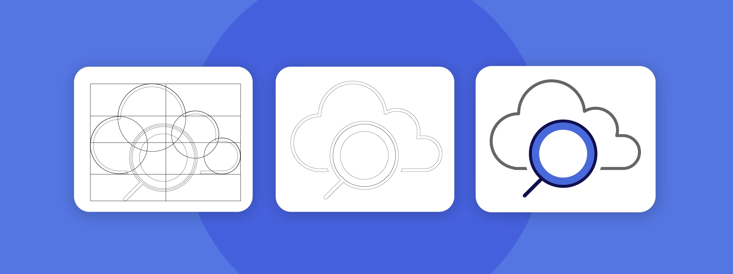
Our graphic designers have thought through and designed each icon with care, to ensure they are all both detailed, and aesthetically pleasing. Here is an example of the layout that gave rise to the icon of one of our most loved features: the Library.
Today most graphic interfaces, especially websites, adapt to the size of the user’s screen: this is called responsive design.
We must consider all possible types of screen to ensure comfortable use, whatever the device (smartphone, tablet, computer …).
Our graphic designers have therefore designed each icon in all the necessary formats so that the UpSlide ribbon can be easily adapted to any computer screen or tablet size. This phase, although a little repetitive and technical, should not be disregarded in the planning of the project because it can be more time-consuming than expected.
In total, nearly 700 icons are generated for a fully dynamic UpSlide tab!
Prototypes and Tests
Once all the elements of the interface are ready to use, they still have to be installed to check that they run properly, and this is done through tests on prototypes.
A first mock-up of the new UpSlide ribbon is then born: it is a culmination of all the previous steps and will serve as a basis for the tests.
To ensure that the UX and the UI are in place, it is essential to test them in actual conditions to be able to monitor user interactions with the new version of the software. The goal is to analyze their behavior in order to identify possible points for improvement.
The biggest challenge is having to put your own opinion and biases to the, to give your users the best experience.
Florian Petitdemange
Lead Designer

For example, in the test phase, we were able to detect that some icons did not meet user expectations. One of the first icons chosen for the Library – the feature allowing you to access graphical or textual elements directly from a Word, Excel or PowerPoint file – was a cloud from which a sheet of paper came out: no test user understood the purpose of this icon. After several tests, the icon evolved with the addition of a magnifying glass, which better illustrated the search function.
Once the problems and bugs that were identified during testing are fixed, the new interface is finally ready for the general public!
Release
Finally the moment you’ve been waiting for! The launch of the new version of your interface can now begin. Make sure you communicate with your users before the release of the new version, to avoid any surprises when updating their tool.
Last year, our UpSlide software took a major turn on the graphic and UX side. This is a great leap forward because, in addition to being graphically aligned with the ribbons in Word, PowerPoint and Excel, the UpSlide tab now includes the most used native features to avoid users having to switch between the different tabs.
Since 2011, UpSlide has evolved a lot, but our objective remains the same: to help you work better on PowerPoint, Excel and Word!
