Looking for an easy way to rebrand your PowerPoint presentations? Whether it’s brand-new templates or minor updates, our guide breaks down each step to ensure everyone in the business uses your new materials from day one.
How to Rebrand Your Presentations
For finance and professional services firms in particular, PowerPoint (PPT) templates are the backbone of a powerful brand. They form the basis of most internal and external documents, such as pitch decks and recurring reports.
1. Always Start with Your PowerPoint Templates
When doing a rebrand or a brand refresh, you should update your PowerPoint templates first – far in advance of your website, social media and brochures. Here’s why:
- Employees are your brand’s first ambassadors: By rebranding your templates first, you ensure your team is aligned and ready to champion your new identity from day one.
- It’s a test run for your visual identity: PowerPoint templates are core to business success. It’s where you pitch for new clients, track performance, and showcase your firm’s value proposition. Testing your visual identity here first ensures your design elements are impactful from day one.
- Templates are reusable and editable: Unlike static marketing materials, such as brochures, PowerPoint presentations evolve with your brand, making them a critical touchpoint in the rebranding process.
2. Gather Your New Brand Elements
To ensure your new PowerPoint templates are cohesive, gather these essential brand assets in advance:
Color Palette
List all the colors from your graphic charter so they’re ready to implement into your new template.
PowerPoint’s color palette includes:
- White (default first color)
- Font color (second slot)
- Brand colors (eight additional slots)
- Custom and standard Microsoft 365 colors
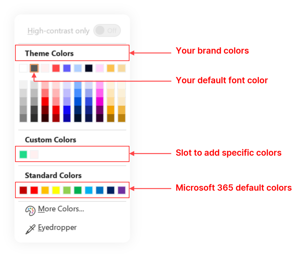
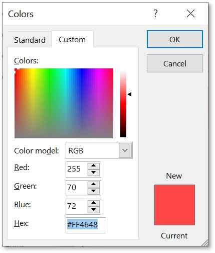
Make note of all the color hex codes (the six-character code starting with a hashtag) so you can manually add them to your new palette.
For example, the hex code for UpSlide’s carmine color is #FF4648.
The hex codes may look like this on your graphic charter:
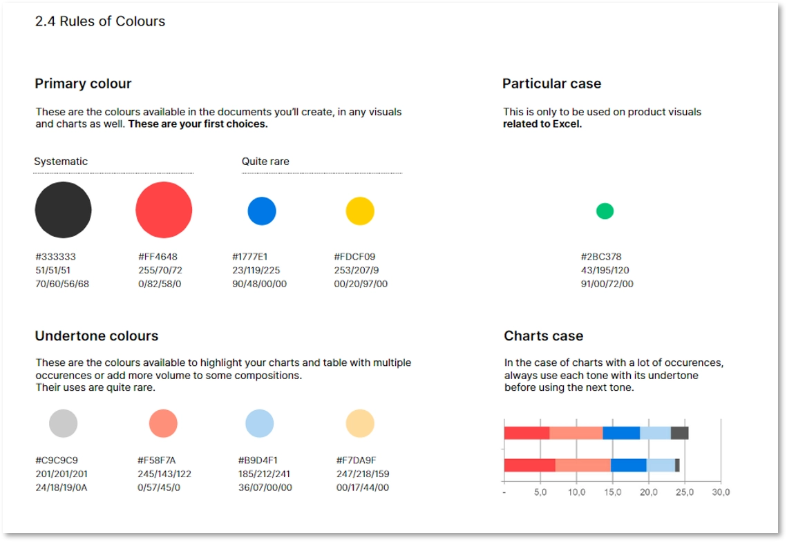
Rules of Color
Here’s a quick insight into the rules of colors for further context.
Primary Colors
Primary colors are used in all the documents you’ll create, including visuals and charts. These are your first choice.
Particular Case
Particular case colors are only for certain circumstances, such as being used on product visuals related to Excel.
Charts Case
Charts case refers to the four colors you’ll use when presenting data visually via a complex chart, such as waterfall charts.
Brand Elements
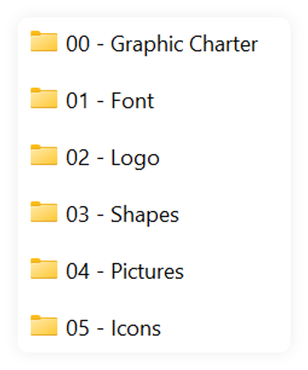
Using your graphic charter, let’s prepare what else you will need to build your template. Create a folder containing the following elements:
- Font: If it’s not a native Microsoft 365 font, ask your IT team to install it as the default on all your company’s laptops.
- Logo: We recommend creating a few variants of your logo, including a version in PNG file format, a white version, and a reduced form (that can be used for a more minimalist look on your slides).
- Shapes: Shapes are a great way to enhance the branding of your presentations. It could be a simplified part of your logo or a symbol of your brand. At UpSlide, for example, we use our iconic bolt as a bullet point.
- Pictures: Corporate pictures are a must-have to make your presentations or website more lively – and more human. They’re also great for talking about your teams or potentially customizing your front cover.
- Icons: Icons help illustrate ideas and are a powerful expression of your visual identity. You’ll find some icons already integrated in Microsoft 365, ready to be filled with the color of your choice.
Top tip
For a more professional feel, we recommend getting your own iconography designed.
Segmenting your folder into different sections makes it easy for teams to navigate the different brand elements:
3. Enter the Slide Master
The Slide Master is like the default slide layout of your template. Each slide you add to your presentation is a duplicate of the Master Slide.
Accessing the Slide Master
Step 1: Go to View > Slide Master.

Try this with your current template or presentation – it should look something like this:
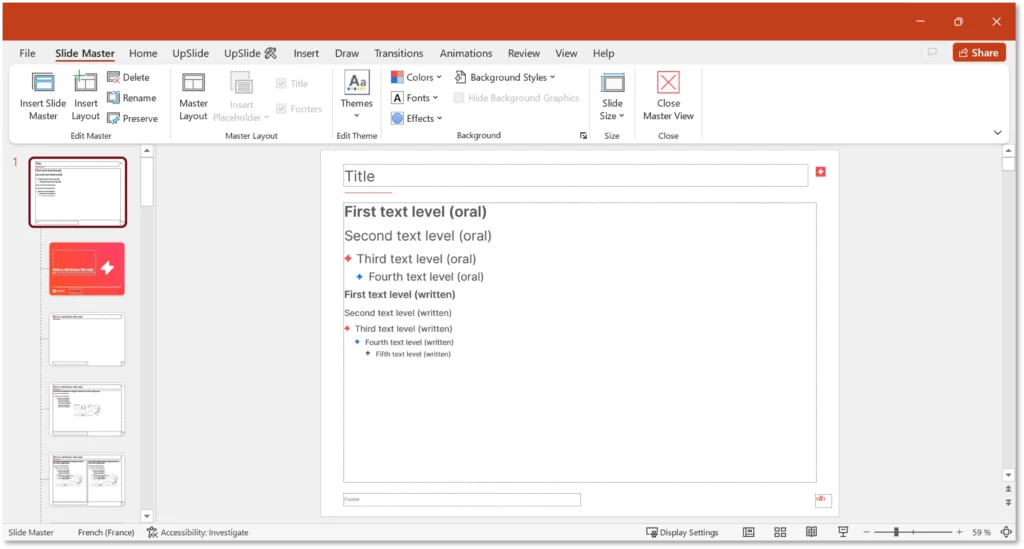
Step 2: Select the first slide. This is your Master Slide (avoid confusing it with other layouts).
Everything you do in the Master Slide will be applied to other slide layouts (except for a few, such as the covers).
Building a New Template
To build a new template from the Slide Master, you have two options:
- Revamp an existing template: Just open your PowerPoint template to get started.
- Start from scratch: Open a new blank presentation (recommended if you didn’t build the previous template).
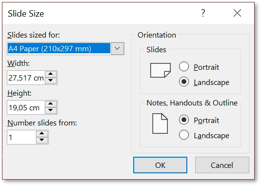
Start by checking you have the right template dimensions. Go to Design > Slide Size > Custom Slide Size…
Our advice is to select A4, as it allows you to print perfectly sized presentations and adapt to any screen size when presenting.
Top tip
If you are starting from scratch, or are having problems with a previous template that you want to fix, read our article 5 Steps to Building a User-Friendly PowerPoint Template before proceeding.
4. Integrate New Fonts and Colors
Here’s how to integrate your new graphic elements into your PowerPoint template:
PowerPoint Fonts
Setting your custom font is relatively straightforward.
Step 1: Click on the Fonts button and select Customize Fonts… at the end of the drop-down menu.
Step 2: A window will open asking you to select your official fonts. You can use the same font for both heading and body.
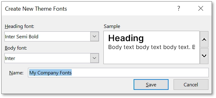
Step 3: Click Save. You’ve now added your official fonts to the Master Slide!
PowerPoint Colors
Let’s do the same with colors.
Step 1: Click the Colors button in your PowerPoint ribbon, then scroll to the bottom of the drop-down menu and select Customize Colors…
Step 2: A new window will appear, allowing you to set your official brand colors. This is where you’ll input your custom palette.
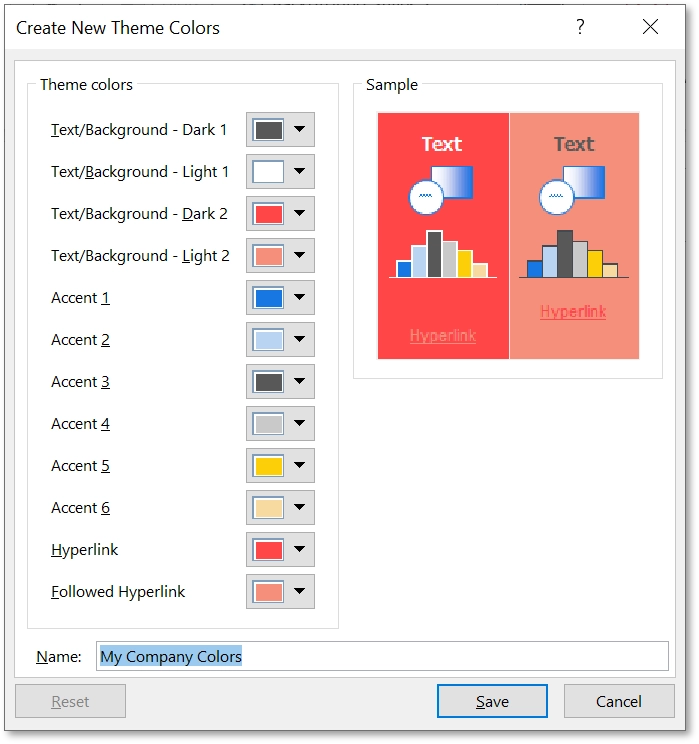
Step 3: Start by setting the first two color slots. Keep in mind that in this view, these are inverted:
- Slot 1: Your font color
- Slot 2: White
Step 4: Select the hex code for each color by clicking the drop-down arrow and select More Colors…
Enter the hex color code:
Step 5: Assign your brand colors for Accent 1, 2, 3, 4, 5, and 6 slots.
Step 6: Don’t forget to include two additional colors for the Hyperlink and Followed Hyperlink options.
Step 7: When you’re done, name and save the color palette.
5. Define Your Text Zones
Setting clear text zones is essential for a professional template. Here’s how to set it:
Step 1: Activate Slide Master mode and select the first size.
Step 2: Define placeholders using the Master Layout button.
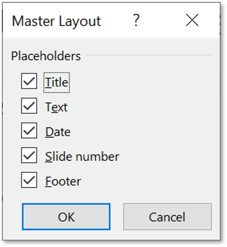
Step 3: Adjust text box properties (e.g., size, position) via Format Shape.
Step 4: Check you have the following properties set up:
Check that you have set up the following parameters for all text boxes:
- Size
- Position
- Text Box
Setting Text Levels
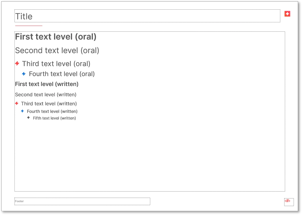
Now, let’s define the text levels. PowerPoint supports up to nine text levels – though only five are visible by default. Customize all nine for consistency:
- Use Alt + Shift + Right arrow (or Increase Text Level) to edit font size, color, and format for each level.
- Include bullet formatting to avoid default PowerPoint styling pitfalls.
Top tip
Organize the first four levels for oral presentations and the remaining levels for written content.
Add the Finishing Touches
- (Optional) Add a separation between the title and the body text to increase readability. This could be a line or shape from your graphic charter. Get creative!
- (Optional) Insert your logo on the right part of the Master Slide. This may not be necessary if you have a strong brand identity (powerful colors, distinctive shapes, etc.). If in doubt, a good balance is to keep only the logotype.
6. Build a Slide Library Within PowerPoint
Once the Master Slide is complete, we recommend creating a library of slide layouts for your team’s needs:
Slide Layouts
Slide layouts are included in your Master and contain positioning, formatting and placeholder boxes, ready for new content to be added.
You can edit and re-apply your slide layouts or add new ones by hitting Insert Layout on the Slide Master tab (if you’re starting from a blank presentation, you can delete the last four).
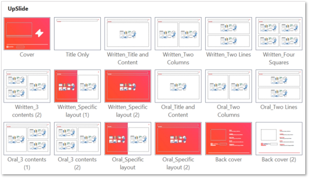
Here are the slide layouts you could create for your teams:
- Cover slides to make a strong first and lasting impression. Tip: Tick Hide Background Graphics to avoid design constraints from the Master Slide.
- Summary slides to structure your content around a clear agenda. Tip: Add a table of contents using Insert Placeholder.
- Divider slide layouts to structure your presentation. Tip: Hide the title and footer placeholders by unticking them on the Slide Mater tab.
- Idea slide layouts (2-4) to build slides effectively. Tip: Apply the grid on the Master Slide by navigating to View and ticking Guides. Then, insert placeholders with right-click > Grid and Guides.
- Special background layouts to highlight sections with a full-slide background shape or partial coverage.
Top tip
Right-click and rename each layout for easy navigation.
You can now close the Master. The hardest part is done!
To see all the new layouts you’ve created, navigate to Home and click on New Slide.
7. Design Your Slide Templates
Slide templates are not part of the Master. They are pre-built slides that users can customize with text, pictures or icons, and should be conveniently stored for easy access.
Store Your Templates in a Convenient Place
- Content management software: Tools like UpSlide allow teams to access pre-built, on-brand slides directly within PowerPoint using a user-friendly Content Library.
- Shared documents: Alternatively, you can store PowerPoint templates in SharePoint, which includes standardized slides for company-wide use. However, this option can limit accessibility and version control, as users may inadvertently download and save outdated versions.
Types of Templates to Design
- Oral vs. written presentation templates: Oral templates typically include concise text and larger fonts for better audience engagement, while written templates accommodate more detailed content.
- Process or timeline slides: These templates help communicate complex projects clearly and concisely. They can include Gantt charts for tracking project phases and milestones or other visually branded formats that maintain clarity and brand compliance.
- Personalized contact slides: Team breakdown slides allow users to quickly insert their own information, while maintaining a professional and consistent look.
- Corporate overview slides: These templates provide up to date, on-brand information about your organization, helping to establish credibility and instil confidence with clients.
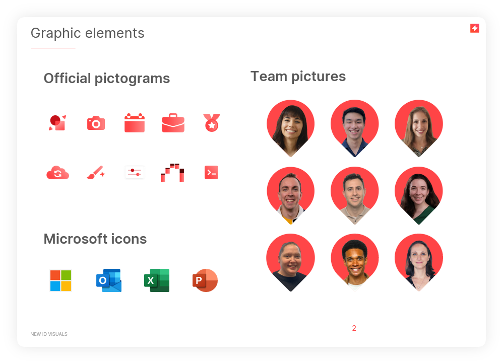
- Shape and icon library slides: Including a library of branded icons, logos, and images allows team members to easily create visually impactful slides that align with your brand identity.
Top tip
If you need some actionable advice for creating flawless slides and avoiding common mistakes, read 8 Powerful Tips for PowerPoint, written by our in-house Microsoft 365 Designers.
Save and Use
Once your templates are ready, save them as a .potx file. When you next open it, a new presentation will open by default. To change the template, open a new presentation, edit the Master, and save it as a PowerPoint template again.
Once you have a solid library of slide layouts and templates, the next step is to convert existing decks to your new templates.
8. Convert Your Old PowerPoint Presentations
Gain an understanding of which templates or decks are most frequently used by your teams, and make sure these are prioritized when converting materials to your new branding.
These could be:
- Commercial pitches and proposals
- Quarterly reports
- Corporate presentations
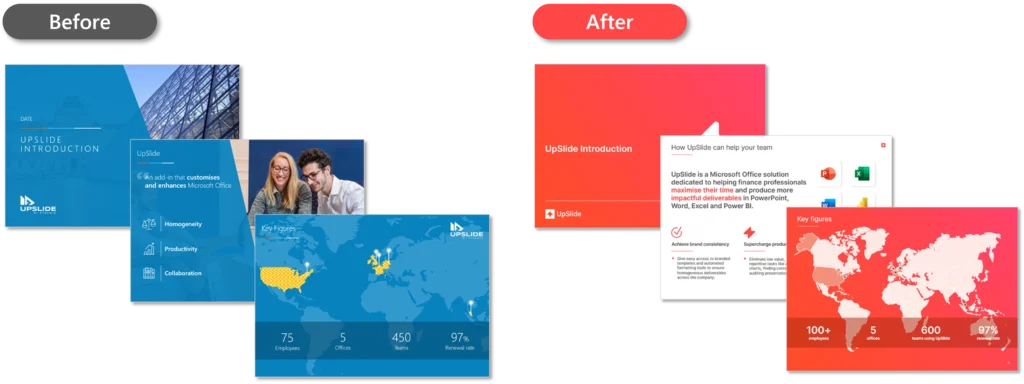
Many companies use UpSlide’s Slide Converter to convert slides from an old template to a new one.
Open your old PowerPoint presentation as well as a slide-free copy of your new template (keeping the covers and section dividers).
Then, follow these steps:
Step 1: Select one or more slides from your old presentation.
Step 2: Navigate to your UpSlide ribbon > Templates > Convert to another presentation.

Step 3: Select Convert to another presentation.
Step 4: (Optional) You can make edits to slides either individually or in bulk. To adjust the layout or colors, just click Conversion Tools within the pane.
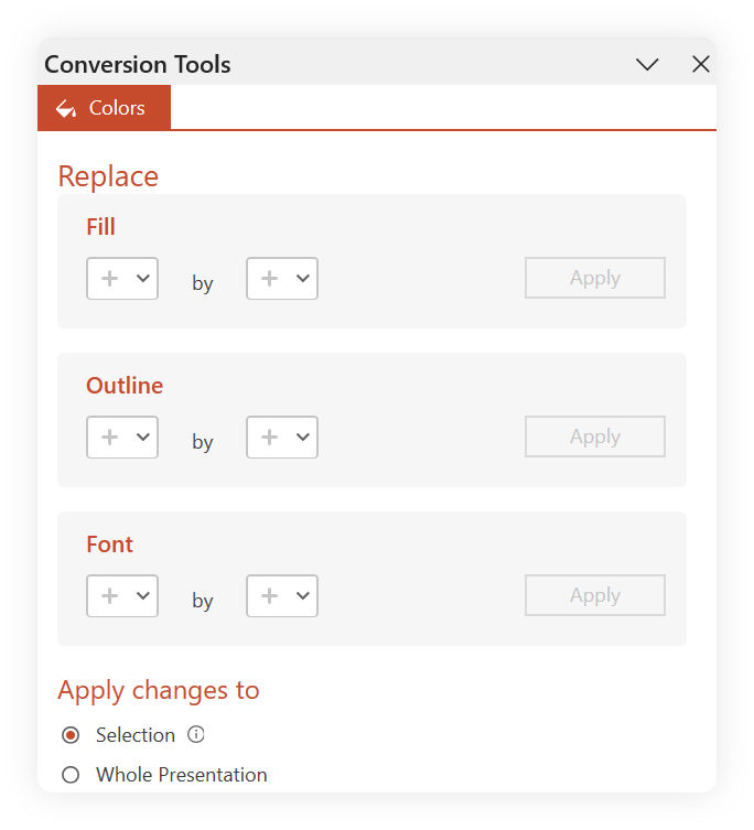
> Get help making Color or Layout adjustments with Slide Converter
Top tip
To ensure that your new PowerPoint templates are used, recruit testers to try out the new templates and ask for feedback. What could be improved? Is there anything missing? Would they rather use their old presentations or your new ones?
9. Enable Easy Access to Your New Templates
To ensure your new templates are used, make finding them as user-friendly as possible.
You could set the new template to default so teams will automatically have it ready when they open PowerPoint.
To do this, ask your IT department to run a script that deploys it to all computers, or use UpSlide’s Template Management Software to publish your templates as default to the entire company.
Here are a couple more ways to share your templates:
Intranet page
Create an intranet page where users can easily download your new templates. For example, this could be a PowerPoint icon with a simple button that says Download Template.

Folder in a shared drive
Use a common folder on a shared drive to host your .potx file and build a library of templates, slides and elements for the company to access.

Top tip
To ensure the template library is kept clean, don’t be afraid to lock key files and make someone accountable. They could monitor what can enter or exit the library, what should be updated, and where feedback should be submitted.
10. Communicate Your New Templates
Now your new templates are ready – it’s time to let everyone know the good news.
Here’s a few examples of how to get teams onboarded:
- Talk directly with team managers so they can get their teams bought into the new materials.
- Run a training session or workshop to walk colleagues through the templates, demonstrating how to integrate them into current workflows and where to find them.
- Set up a feedback survey to ask for continuous feedback.

Top tip
Encourage teams to ask clients for feedback and note this down for your next iteration.
For more advice on launching your new identity across all touchpoints, read our article 6 Steps to Launching our New Visual Identity that explains how UpSlide successfully shared the news.
Key Takeaways
Rebranding and updating your PowerPoint presentations is easy when you have access to the right tools, such as UpSlide’s Slide Converter.
Make sure you onboard a reliable team of experts, recruit brand ambassadors from day one, and enable easy access to your new templates company wide by setting it as default.
Bookmark this guide and refer to it next time you update your templates, whether you’re rolling out brand new presentations or minor updates.
For help revamping your PowerPoint presentations, get in touch with our Financial Design Studio team – they have years of experience creating gold-standard deliverables that your stakeholders, colleagues, and clients will love.
TL;DR
Start with PowerPoint: Update your PowerPoint templates first (before static materials) to create a consistent foundation for your new brand identity.
Optimize with Slide Master: Use the Slide Master to integrate brand elements like fonts, colors, and logos for uniform layouts.
Rebrand existing documents: UpSlide’s Slide Converter can quickly transform existing materials, such as pitchbooks, into your new templates.


