

Learn how to build beautiful Gantt charts in PowerPoint—manually or in a fraction of the time with automation—to ensure project success from day one.
Gantt Charts in Financial and Professional Services
What is a Gantt Chart?
A Gantt chart is a type of bar chart used to visualize a project schedule. It displays tasks along a timeline, showing their start and end dates, durations, and dependencies. By offering a clear overview of the project, Gantt charts help teams track progress, identify bottlenecks, and ensure tasks are completed on time.
In financial and professional services, Gantt charts are frequently created in PowerPoint and Excel for (but not limited to):
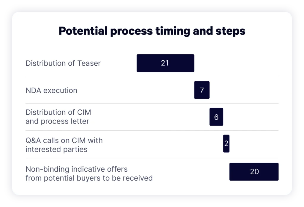
- Pitches and weekly updates: Investment banking teams use Gantt charts to deliver clear timelines that align stakeholders through each deal stage, from building marketing materials to negotiation and final signing.
- Due diligence reports: Financial advisory teams use Gantt charts to map strategic synergies in the VCP (Value Creation Plan).
- Quarterly portfolio updates: Portfolio managers use Gantt charts to track the execution of operational improvements in portfolio companies, such as a 6-month cost-reduction program.
How to Manually Create a Gantt Chart in PowerPoint
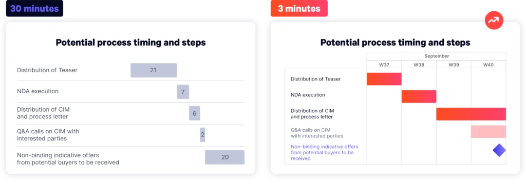
Time: 30 minutes
TL;DR: You can manually build Gantt charts by opening PowerPoint and starting with a Stacked Bar chart. You can achieve a presentable result, though it requires a lot of manual formatting.
Follow these steps to start building a Gantt chart in PowerPoint manually.
Step 1: Create a Basic Stacked Bar Chart
1. Open PowerPoint and insert a Stacked Bar chart via Insert > Chart. In the pop-up, select Bar from the left-hand pane.
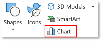
2. Choose Stacked Bar type.
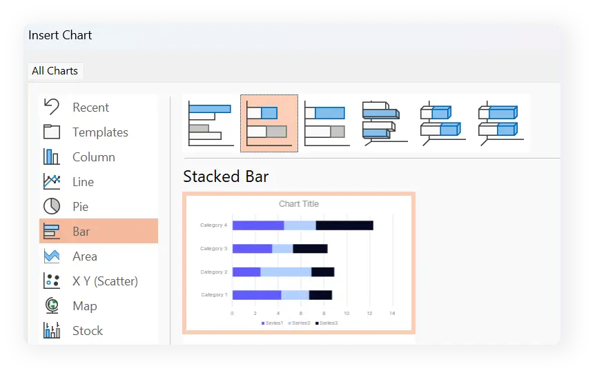
3. A standard Stacked Bar chart will be inserted into your slide, along with a new Excel table containing placeholder data.
Top tip
Click the paintbrush icon to change style or color scheme.
Need help updating your color palette? Check out our blog: Rebranding Your PowerPoint Templates.
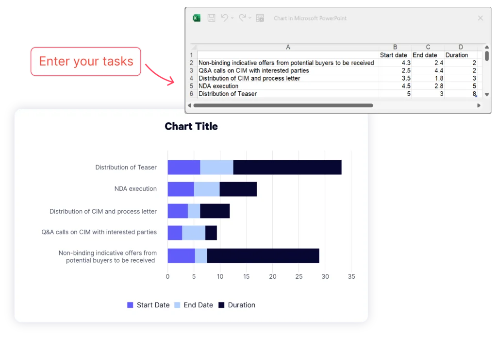
Step 2: Enter Your Project Data
1. Begin by assigning a Start Date, End Date and Duration (number of days) to each. List your tasks in Column A, replacing the existing data with your own. Rename Series 1 to Start Date, Series 2 to End Date, and the last column to Duration (days).
2. Before entering the dates, you’ll need to format these columns. To do this, select columns B and C, right-click them, and choose Format Cells from the menu.
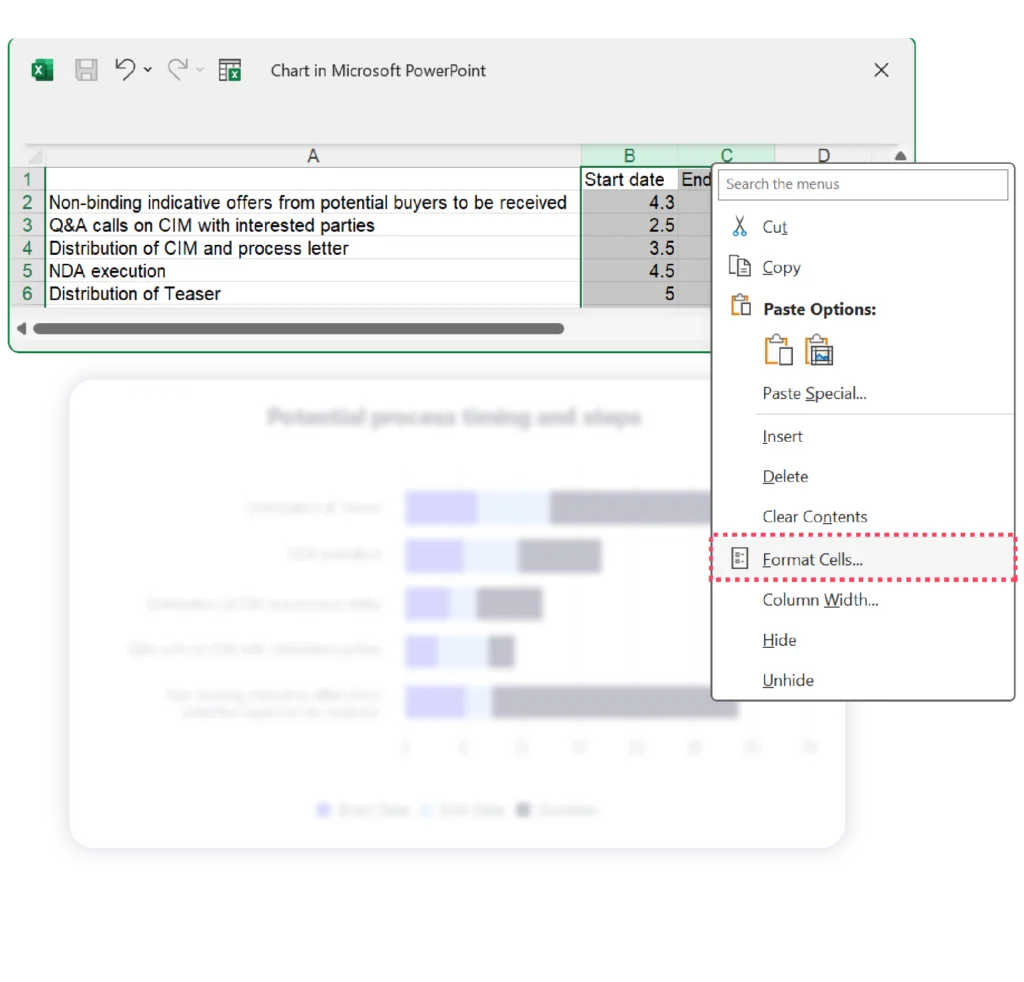
3. In the new window, select Date (from the Category list on the left) and pick your desired data format from the Type menu.
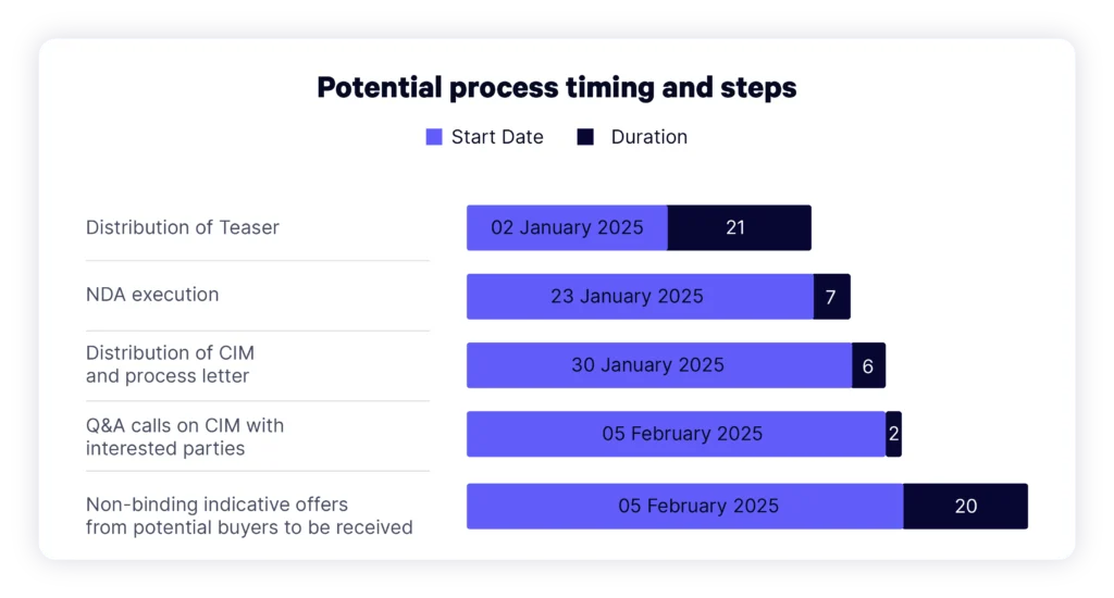
4. Once you’ve set the format, insert your task dates. Note: the dates may be illegible and overlap at this point, but don’t worry, we’ll fix this in the next step!
5. Calculate the duration of your tasks using the formula =$C2-$B2 in cell D2. Drag the formula down to apply it to all rows, filling the Duration column with the number of days for each task.
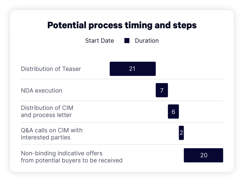
6. After calculating the task durations, you can remove the End Date from your graphic using Chart Filters on the right-hand side of your graphic. Uncheck the box next to End Date and click Apply.
7. Now choose a style that best suits your project needs.
Step 3: Format Your Graphic and Turn It Into a Gantt Chart
1. To turn your graph into a Gantt chart, you need to make the blue sections transparent, so only the black ones are visible. Click on any blue bars to select all of them, and right-click to open the mini toolbar. Click on the Fill icon and select No Fill.
Your Gantt chart should now look like this:
Top tip
Use your brand colors or a minimal palette to improve readability. Avoid overly bright colors or clashing colors.
Step 4: Customize Your Chart
1. Now you have a functional Gantt chart, let’s customize it. Here are three elements to enhance:
- Standardize fonts: Use a single font style and size for text throughout the chart to maintain readability.
- Prioritize information: Only include the most relevant tasks and milestones to avoid overwhelming your audience.
- Remove the legend: Keep the graph as concise as possible by removing the Start Date and Duration below the title. To remove it, select it and press Delete.
Here is your finished Gantt chart, created manually:
Remember: if you close your PowerPoint, your Excel data window will close too. To re-open it, right-click your Gantt chart and select Edit Data.
Top tip
If you’re managing multiple projects or need quick professional Gantt charts, automation tools like UpSlide are enterprise-scalable, improving efficiency and ensuring brand consistency company-wide.
Limitations
There are several limitations to formatting a Stacked Bar chart into a Gantt chart:
- Manual adjustments: Requires significant manual effort to align bars accurately for start/end dates.
- Limited precision: Lacks built-in date/time scaling and granularity for overlapping tasks.
- Too cluttered: Difficult to manage and interpret for large datasets or complex projects.
- No dependency tracking: Cannot visualize task dependencies or milestones effectively.
- Design constraints: Demands significant effort, and the result isn’t as clean or professional as using a pre-built Gantt chart.
Looking to overcome these limitations? Let’s explore how automation makes building Gantt charts much simpler.
Recommended: How to Automatically Create Gantt Charts
Time: 3 minutes
TL;DR: Automation eliminates the inefficiencies of manual creation, saving hours while producing flawless, brand-compliant Gantt charts.
Why Automate Gantt Chart Creation?
Manually creating Gantt charts in PowerPoint can be time-intensive and prone to errors. Automation tools like UpSlide eliminate these inefficiencies, offering significant advantages for financial services professionals:
- Time savings: Streamline formatting and make flexible updates, freeing up hours for strategic work.
- Accurate data: Deliver consistent, professional presentations without the risk of human error.
- Brand consistency: Ensure your Gantt charts conform to your brand guidelines every time.
Step-by-Step Instructions for UpSlide’s Gantt Chart Feature
UpSlide’s Gantt Chart Software makes your workflow smoother and more efficient, allowing you to quickly create and update Gantt charts that align with your branding and project timelines. Follow the steps below to get started:
Step 1: Open the Gantt Chart
You need UpSlide to follow this method!
- If your organization already uses UpSlide, check if they have deployed the Gantt Charts option.
- If you aren’t yet using UpSlide, book a discovery call to get started.
1. Open an empty template by going to Home > Add-ins > UpSlide Gantt.
2. Click + Add a new activity to start adding tasks and dependencies. You can easily set up tasks and their relationships with just a few clicks.
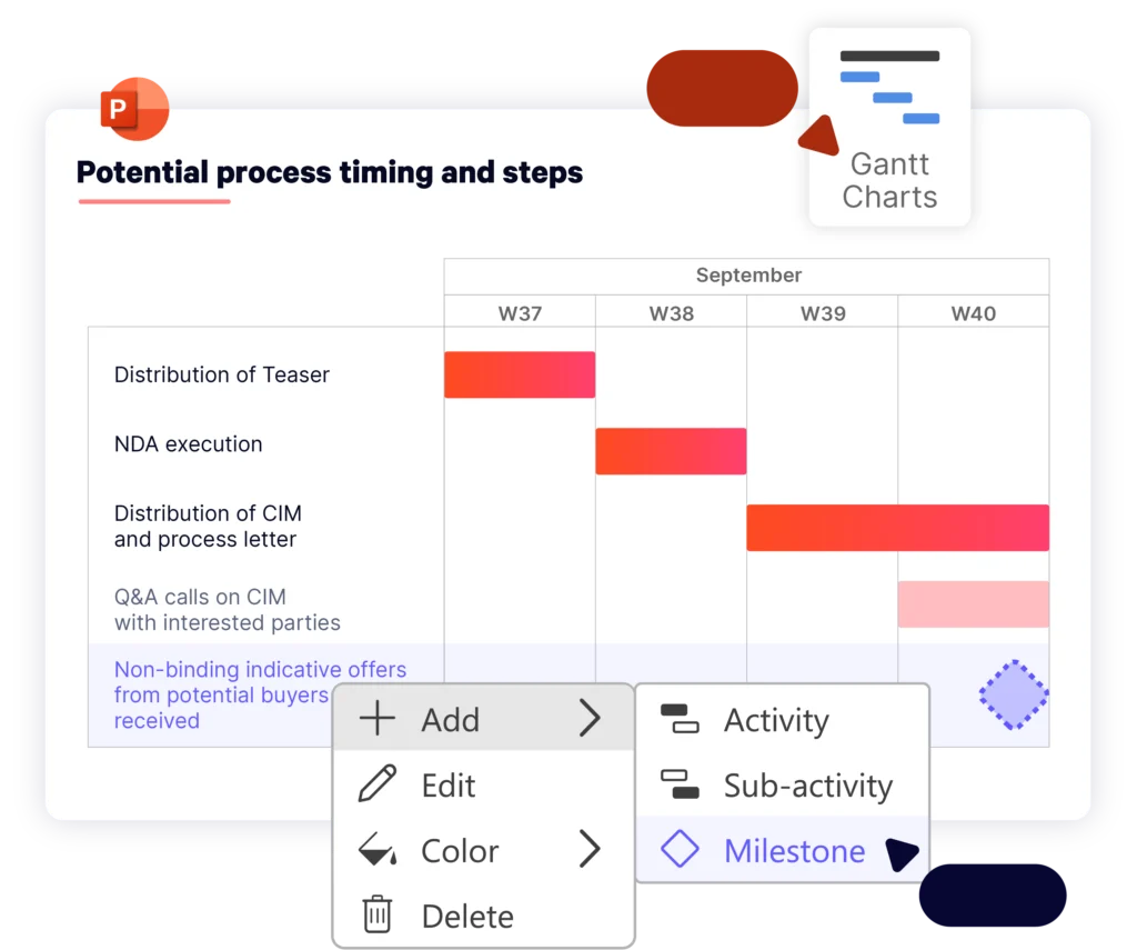
Step 2: Adjust Dates and Progress
1. Drag and drop along the calendar axis to adjust dates and set progress indicators.
This intuitive functionality makes it easy to update timelines without having to manually resize or reposition elements. The Gantt chart automatically adjusts, ensuring it’s always accurate after you have made changes.
Step 3: Customize Your Chart’s Branding
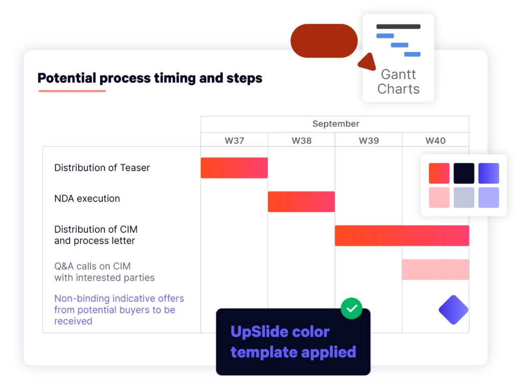
1. Your new chart will automatically be formatted in your branding, so you don’t need to worry about customizing fonts, colors, or layouts.
2. However, if you wish to choose other colors from your template, simply right-click on any task and select Colors.
Step 4: Easily Update and Refresh
1. As projects evolve, so should your Gantt chart. With UpSlide, adding new activities, sub-activities, and key milestones at any time is easy.
2. Simply click + Add a new activity to add new elements, and the chart will automatically adjust, ensuring everything stays aligned.
Step 5: Present with Confidence
1. Your Gantt chart is now ready to present! All stakeholders will be able to view it, whether or not they have UpSlide installed.
Automation ensures your Gantt charts are always accurate, on-brand, and ready to present to stakeholders.
Automation vs Manual: How Do They Compare?
Here are the main differences between creating a chart manually in PowerPoint or using UpSlide’s Gantt chart automation:
| Benefits | Manual | Automated (UpSlide) |
| Time efficiency | 30+ minutes: The process of transforming a stacked bar chart into a Gantt chart is lengthy and time-consuming. | 3 minutes: Generate and format charts in seconds with drag-and-drop. |
| Ease of use | The workflow is complex and prone to errors, potentially causing frustration for users. | Enjoy user-friendly tools with an intuitive interface. With automation, you can create a beautiful Gantt chart in just one click. |
| Customization | There is limited customization. Making color, font, and layout adjustments requires manual formatting. | Automatically apply brand-compliant formatting with your graphic charter. |
| Output quality | The end result is presentable, but it requires significant effort and isn’t scalable. | Deliver flawless, on-brand charts with minimal effort. |
| Cost | While it’s free, it’s time-intensive for each user. | Choose a pricing package and benefit from substantial time savings. |
Other Ways of Building Gantt Charts in PowerPoint
If automation isn’t an option, there are a few other free ways to build simple Gantt charts:
Office Timeline Basic
Office Timeline Basic is a free lightweight tool for creating simple timelines and Gantt charts within Microsoft PowerPoint. It’s ideal for professionals who need to present simple project schedules, milestones, or deliverables visually. Here’s a breakdown of the pros and cons:
Pros:
- Free: Enables easy creation of simple Gantt charts for no cost.
- Simple updates: Updates are easier to make compared to configuring a stacked bar chart.
- Clean visuals: Produces polished, professional-looking timelines for presentations.
Cons:
- Basic functionality: Missing options like swimlane diagrams, multi-level timelines, or complex formatting for larger projects.
- No data export capability: Limited flexibility for sharing or further analysis outside of PowerPoint.
- Limited scalability: Only suited for small-to-medium projects.
While Office Timeline Basic is free, you can only produce basic Gantt charts that aren’t suitable for managing big projects in financial or professional services.
Downloadable Templates
You could also try downloading a template. Smartsheet has an array of Gantt chart templates suited for PowerPoint use, designed for managing simple charts to multiple complex projects.
Get started with PowerPoint Gantt Chart with Dependencies – it shows the duration of each task, with markers for milestones, risks and tasks ahead of schedule.
Pros:
- Free and accessible: Many templates are available at no cost and are easy to download and implement.
- Less initial manual work: Pre-designed templates save the effort of building charts from scratch, allowing you to focus on the data itself.
- Professional end results: Templates are often polished and presentation-ready, requiring minimal effort to look good in PowerPoint.
Cons:
- Manual updates: While templates are helpful for initial setup, updating them as projects evolve can be a tedious and manual process.
- Scalability issues: Templates may struggle to accommodate larger or more complex projects, particularly if tasks or dependencies change frequently.
- Limited customization: Some templates may not fully match your specific project needs, leading to additional formatting work.
While downloading a template will save time on initial setup, updating tasks going forward is still manual and doesn’t simplify the workflow as much as dedicated automation software.
Inserting Table and Shapes
You can also create a customizable Gantt chart in PowerPoint by inserting a table with columns (to represent time units) and rows (for task names). Then, overlay rectangles on the table cells to indicate task durations, and use small circles or diamonds for milestones. Arrows can also be used to show task dependencies and ensure a clear visual sequence.
Pros:
- Customizable: You have full control over design, colors, and layout.
- Flexible: Task durations and new tasks or milestones are relatively simple to add, although you must ensure you’re moving them with precision.
- Free: If you’re already working in PowerPoint, this method involves no additional cost.
Cons:
- Time-consuming: Hours can be spent getting the chart presentable, especially for large or complex projects.
- Limited automation: No automatic updates or calculations are in place for task durations or dependencies.
- Accuracy issues: As the project evolves, maintaining accuracy with manual updates can become difficult, especially with changes in timelines.
While this method offers flexibility, it can be time-consuming and challenging to maintain accuracy, especially as projects evolve. For larger or more complex projects, automated solutions remain the most efficient option.
Key Takeaways
It’s possible to build Gantt charts in PowerPoint manually by starting with a stacked bar chart and heavily formatting it, or by inserting a table and shapes. You can also use basic plug-ins or download templates online. However, these are either time-consuming, overly complex, or lack scalability for large-scale projects.
In financial and professional services, automation is crucial for managing workloads and meeting project deadlines. While a paid solution, UpSlide’s Gantt Chart software offers a huge productivity boost for teams of five up to enterprises of over 50,000 users – ensuring better output in significantly less time.
To get started, speak to an UpSlide expert today!
TL;DR
Dynamic Gantt charts can be built manually in PowerPoint by starting with a stacked bar chart, entering project data and formatting it. However, it’s time-consuming and prone to errors.
Inserting a table and adding shapes is an alternative manual method that gives you more control over the design, colors, and layout. However, maintaining accuracy is challenging.
Templates or plugins are limited and can be a bit easier than manual building; however, they still lack scalability and efficiency.
Productivity software, like UpSlide, automates Gantt chart creation, saving time, ensuring accuracy, and delivering professional, brand-compliant charts in minutes.